Hello, my name is Renato Corrales and I'm back with another blog. In this blog, I will be talking about the final part of the editing process for our music video. For our music video, we came to the conclusion to use Capcut as our final software. When using Capcut, was a very simple app to edit and utilize. It had features such as music sound effects and text. This would be beneficial to our video cause for instance, when wanting to put our music in the background of our scenes, it could be easily done. It had a range of options such as limiting how much of the audio is heard, fading in and out, and choosing how to sync our music with the clips. Another example was wanting to add 2 scenes in the beginning saying, "Don't tell our teacher" and "The budget for this video was ...". With the text feature, this was efficiently done, with choices of being able to choose what font, color, and size. Furthermore, since we had all the scenes complete and ready, it was...
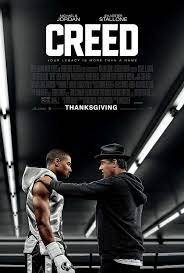
Creed (Sports Drama): CAMS • Fights • Uses dynamic camera angles during the boxing sequences. Low-angle shots often emphasize the power and dominance of the fighters, while close-ups capture the intensity of the exchanges. • Training • Wide shots and aerial views are commonly employed during training montages. These shots showcase the physicality of the training process and the dedication of the protagonist. • Relationships: • Various shot sizes and angles are used to convey character relationships. Close-ups during emotional moments and two-shots or over-the-shoulder shots help establish connections between characters. • Soundtrack: • Features a powerful an...
Comments
Post a Comment